

New Year, New Look
I swear this is the last time I want to do this

IN BRIEF:
First off, we got a cracking review in for Parallels recently, calling it “top-notch storytelling, whip-smart and engaging from ground zero to the out-of-the-blue ending that promises more to come”. Read the whole review at readerviews.com
As referenced at the beginning of Nov, the great Ray Adams Cover Experiment continues. However, I finally think I have it cracked now. More below.
I’ve started writing again. Small steps, but words have been emerging.
ON WRITING:
Yes, it’s true, my range of Ray Adams-branded space adventures have yet another new look…

The previous incarnation came about as I had become more aware of my responsibilities around the use of generative A.I. Nobody wants or needs another author post about why A.I. is a bad thing, so to keep it brief:
Artists’ and writers’ work is being appropriated, without their consent or any remuneration (i.e. stolen), to train A.I.
Artists’ and writers’ opportunities to earn are then being eroded by the same A.I. that’s been trained on their stolen work.
Huge quantities of water and energy are being spent on generative A.I., often for nonsense like fleeting online trends for creating images of users as action figures or whatever.
By getting computers to make art for us, we’re outsourcing one of the most life-affirming creative activities we can undertake, because we don’t value learning skills anymore, and because soul-less tech bros want to monetise one of our deepest needs, that of creative self-expression.
I’d got swept up and, in my ignorance, used A.I. to create some, admittedly pretty nifty, covers. Then realised the above, and binned them in order to create covers from free images available from Pixel and/or similar.
See where this is going?
Yeah, I hadn’t considered the possibility that those images I was getting from Pixel et al had themselves been created using A.I. And, in fact, as I was sitting looking at the design I’d come up with for the forthcoming sixth book, it became pretty obvious pretty quickly that the image I’d chosen had, indeed, been created by A.I.
Because I’m a plum, and sometimes even when I’m trying to do the right thing, I don’t always see all the potential pitfalls straight away.
My nascent writing career still being at the level of ‘success’ that it is, I still wasn’t in a position to pay someone to come up with designs for me. Which left me with a limited array of options. I considered using images in the excellent Public Domain Image Archive. This is a responsibly sourced collection of thousands of images in the Public Domain, which are free to download and, provided you’re not just reproducing them, even use for commercial purposes. Cropping, adding titles, colouring… this would all meet the requirements for adding originality to them and so would have been a legitimate source for book covers. Most importantly, it’s all old stuff - no computer-generated images here. I knocked up some pretty neat new covers, and it is still something I would consider doing in future.
But, the one thing I soon realised I was lacking was a consistent look for the range. Thousands of images there may be, but to find the right image, and then find a series of right images to work both with the individual titles and with the rest of the books - that was a tall order.
Then it hit me.
I started off the Ray Adams books with an intention to write the kind of sci-fi that used to be churned out in cheap paperbacks in the 50s, 60s and 70s. Those little paperbacks you sometimes stumbles across in charity shops or second-hand book stores. And the covers on those things are wild. All manner of stuff from those highly-detailed Chris Foss paintings of giant spaceships and weird aliens (which often bore no relation to the plot of the book inside) all the way through to…
Totally abstract/stylised images.
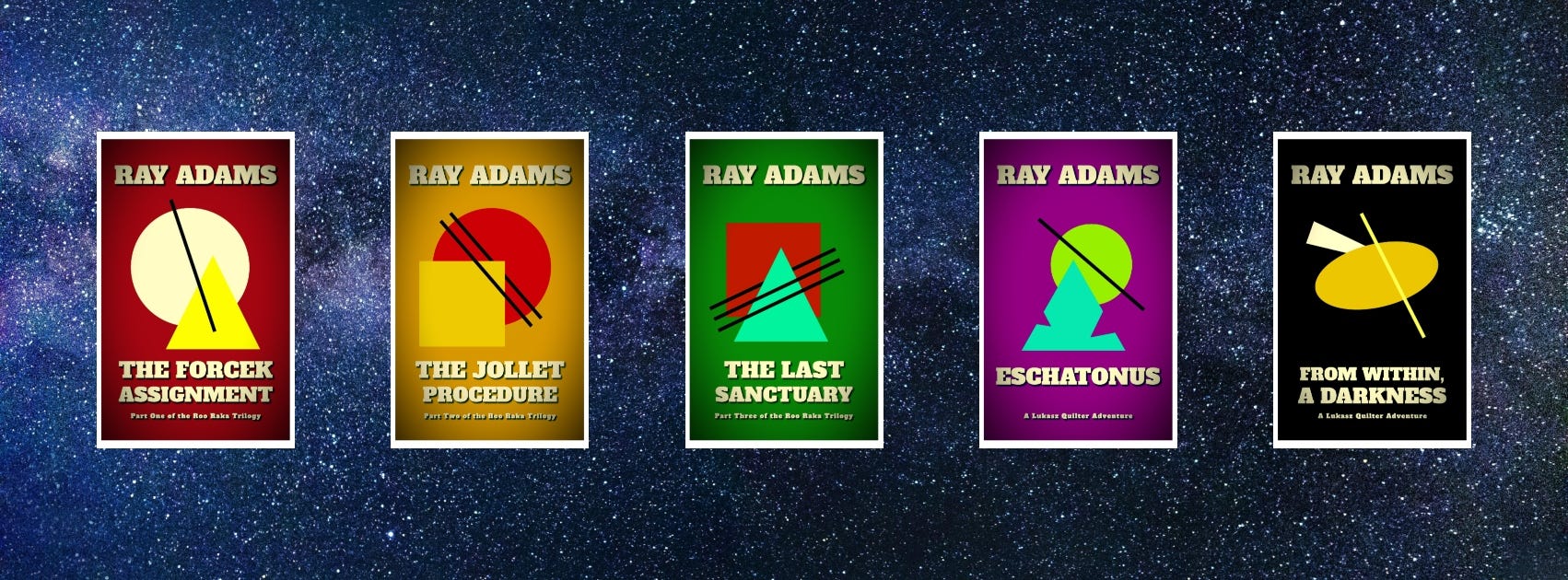
In contrast to my usual approach, I’ve sat on these a few weeks to make sure I’m happy with it, rather than knocking one up in the morning and uploading to KDP after lunch. I wanted to make sure this was the route I wanted to take. Not least of all because I really hope these are the last bloody ones I do. I began the whole process back in early November, and had the first versions of these kicking around some weeks. And you know what? I remain really chuffed with them.
Simple shapes, lines and colours, with almost an Art Deco feel, and a simple filter over the top to give the colour a hint of texture. Bold, simple, completely non-A.I. and creates a connected brand ‘look’.
Five years into the writing malarkey and I’m still not getting it right all the time, but I’m persevering, learning as I go along. All I can do, right?
I have enjoyed:
Judgement at Nuremberg - Spencer Tracey, Burt Lancaster, the mighty Richard Widmark, Marlene Dietrich, Maximillian Schell, Judy Garland, Montgomery Clift… Who wouldn’t want to see any film with that cast? But the names aren’t the point. This legal drama, which follows the prosecution of four members of the German judiciary1 in 1948 for their participation in Nazi atrocities, asks all the big questions about justice vs forgiveness, expediency vs morality and about who isn’t to be held accountable for a nation’s wrongs. Schell won an Oscar for his role as defending counsel, but Lancaster as one of the judges on trial is arguably the film’s focal point, as his refusal to recognise the tribunal’s authority cracks and he delivers a devastating monologue about the consequences of passive participation in evil. More important today than it ever has been.

Burt Lancaster as Ernst Janning in Judgement at Nuremberg Oppenheimer - Finally got around to seeing Nolan’s biog of the father of the atomic bomb. Truly impressive, not least for maintaining its focus throughout its gargantuan running time, but maybe most of all for rendering its somewhat dry and legalistic subject matter - this is in many ways less about the development of the bomb than it is around Lewis Strauss’ bid to throw Oppenheimer under the bus for his supposed communist leanings in order to silence the scientist’s public opposition to further development of nuclear weapons after the war - in a clear and intelligible manner2.
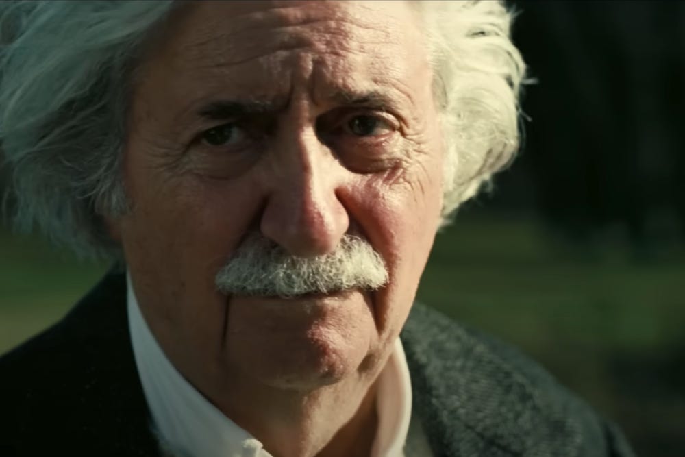
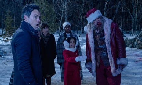
A disappointing turn from Alfred Molina as Einstein. Doesn’t stick his tongue out once. Violent Night - In which a disillusioned Santa Claus3, fed up with the commercialisation of Christmas and the cynical consumerism of modern kids, has his faith restored by the innocent trust placed in him by a young girl when her rich family is taken hostage by a team of crooks in order to rob them. In addition to having his existential crisis resolved, Santa also rescues the girl and her family by taking the crew of villains apart with a sledgehammer. Because his origin story is that he used to be a Viking warrior and the film is, after all, called Violent Night. Expect plenty of claret.
That’s not Scott Baio playing the girl’s dad, or the guy from Superstore. But you will spend the whole movie wondering if it is. Weekend at Bernie’s - The Greatest Film Ever Made About Two Low-Level Office Jerks Who Pretend Their Dead Boss Is Still Alive In Order To Hit On Women. Accept no substitutes.
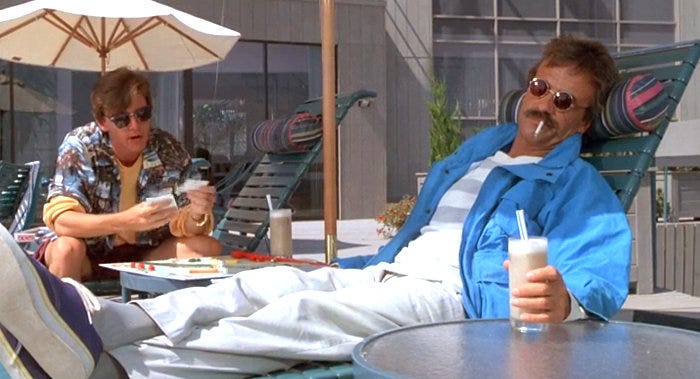
Terry Kiser as Bernie, robbed of the Best Actor Oscar by Daniel Day-Lewis for some film called My Left Foot. Travesty.


You can buy It’s Hard to Tell You This, Parallels, and Greyskin directly from Deixis Press. Playtime’s Over is published by Propolis. All should also be available from all the usual places, online and off.
Ray Adams’ self-published books are available from Amazon, until I get around to finding a more ethical alternative, or out of my garage.
I also review books on my website, most of which are available through my affiliate book shop on uk.bookshop.org - it’s a great alternative to certain online leviathans owned by Trump-supporting billionaires, and supports independent bookshops. Affiliates also get a % of books sold through them, so if you buy something from them, I gets paid...
Making the arguments so much more nuanced than if it were, say, high-ranking Nazi officers on trial.
More intelligible than, say, that run-on sentence.
As in, actual Santa. Not a store-Santa or something.
 | A guest post by
|
Chris Foss = God!
Anyway, feel your pain. But have a look at Getcovers - a Ukrainian outfit that uses free images and no AI and can do you a cover for a couple handfuls of dollars. I've used them for all my straight scifi. They've never let me down.